Monthly Overview
The Monthly Overview is your financial report card — a single page that brings together your net worth movement, budget health, investment performance, and spending patterns for any given month.
Use the month selector at the top of the page to navigate between past months and compare how your finances have evolved over time.
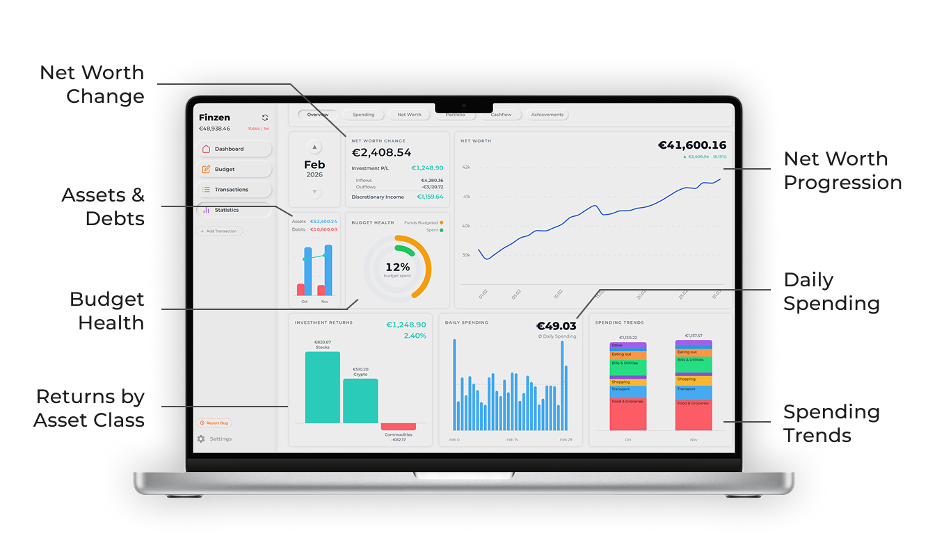
Each card on the Monthly Overview surfaces a different dimension of your financial month.
Net Worth Change
The headline number. This card answers the most important question of the month: did your net worth go up or down, and by how much?
The calculation has two components:
| Component | What it represents |
|---|---|
| Investment P/L | Gains or losses from your investment accounts this month |
| Discretionary Income | Your inflows minus your outflows (income minus spending) |
Together: Net Worth Change = Investment P/L + Discretionary Income
The card also shows a breakdown of your Inflows, Outflows, and the resulting Discretionary Income so you can see exactly what drove the change.
Discretionary Income can be negative — for example, if you spent more than you earned this month. A negative discretionary income combined with positive investment returns may still result in a net worth gain.
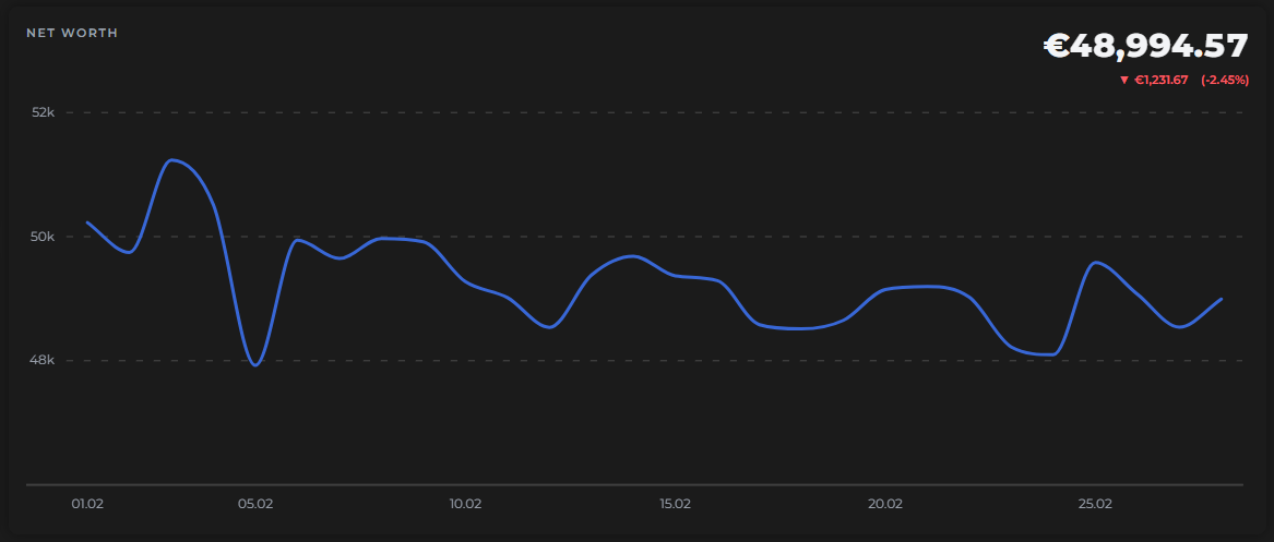
Net Worth Chart
To the right of the Net Worth Change card, a day-by-day chart traces how your net worth moved throughout the month. Each point reflects your total assets minus total liabilities as of that day.
The card also displays your current net worth and your P&L since the start of the month — so you can see at a glance how much ground you've gained or lost.
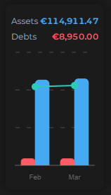
Assets & Debts
This chart compares your assets and debts between last month and this month using a side-by-side bar chart, with a net worth line overlaid to show the combined result.
It's a quick visual check on whether your balance sheet is improving — are your assets growing? Are your debts shrinking?
Budget Health
Two rings summarize the health of your envelope budget for the month:
- Spent — the percentage of your total budget that has been spent so far
- Funds Budgeted — the percentage of your liquid funds (the balance across all on-budget accounts) that have been assigned to envelopes
These match the indicators shown in the Budget page header — the Monthly Overview just surfaces them here for your monthly snapshot.
A well-managed month usually means the Spent ring tracks your progress through the month (e.g. 50% spent halfway through), and the Funds Budgeted ring sits close to 100% — meaning you've given every dollar a job.
Investment Returns
A bar chart breaking down your investment P/L by asset class for the month — stocks, ETFs, crypto, and any other asset classes you hold.
Above the chart, you'll see your total investment return for the month, shown both as an absolute value and as a percentage.
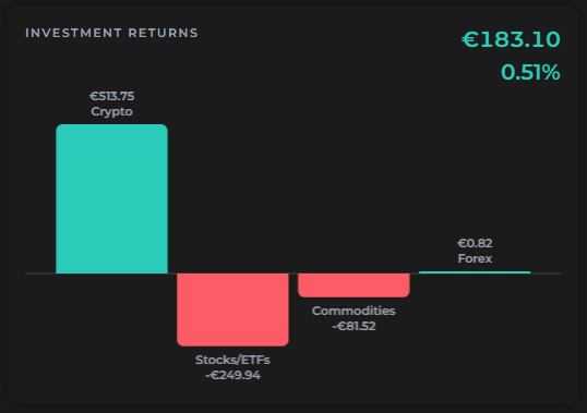
This card reflects the same P/L figure used in the Net Worth Change calculation — it just gives you a more granular view of where those returns came from.
Daily Spending
A day-by-day bar chart of your outflows, so you can see which days you spent the most. The card also shows your average daily spending (marked as Ø) for the month.
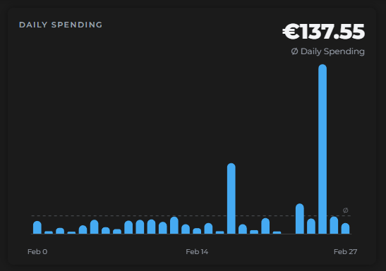
Useful for spotting patterns — recurring high-spend days, quiet weeks, or one-off splurges.
Spending Trends
A stacked bar chart comparing last month's spending to this month's, with each bar broken down by subcategory. Totals are shown for both months so you can see at a glance whether overall spending is up or down.
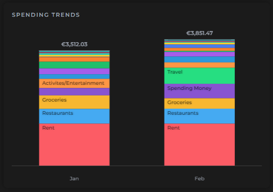
The subcategory stacking makes it easy to see not just the total difference, but where that difference came from.
Use Spending Trends as a quick gut-check: did I spend more or less than last month? And on what?