Cash Flow
The Cash Flow report tracks money moving in and out of your on-budget accounts over time. Use the Breakdown tab for a detailed chart and monthly history, or the Sankey tab to visualize the complete journey of your money.
Breakdown
The default view when you open Cash Flow. Three summary cards give you an instant read on your cash position, followed by a chart and a monthly history sidebar.
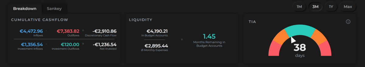
Cumulative Cash Flow
Shows the net result of all money moving in and out over the selected time range:
- Inflows − Outflows = Discretionary Cash Flow — how much money you kept after spending
- Investment Inflows − Investment Outflows = Net Invested — the net amount deployed into investments
Liquidity
Shows how long your current budget account balances could sustain your current spending pace:
Budget account balance ÷ Average monthly expenses = X months remaining
This is your financial runway — a quick way to gauge whether your cash cushion is comfortable or thin.
How "Average monthly expenses" is calculated
- Averages your spending over the last 6 completed months (or fewer if you haven't been tracking that long), so the figure reflects your recent habits rather than your entire history.
- The current, in-progress month is excluded once you have at least one completed month. This prevents early-month distortions — e.g. paying rent on the 1st won't temporarily inflate the average.
- Investments are excluded. Money moved into investment categories is treated as saving, not spending, so it doesn't shorten your runway.
- In your very first month of tracking (no completed months yet), the current month is projected to a full-month estimate based on spend so far.
Time in Account (TIA)
A gauge showing the average number of days money sits in your budget accounts before being spent. Finzen uses the FIFO (first in, first out) method — the oldest funds are matched to outflows first, and the weighted average age across all matched dollars gives you your TIA.
| Range | Zone | What it means |
|---|---|---|
| 0–14 days | Fast | Money flows out almost as quickly as it comes in |
| 14–30 days | Thin | Some buffer, but not much — build more cushion |
| 30–120 days | Healthy | A solid buffer — keep steady |
| 120–240 days | Idle | Cash is sitting longer than necessary — consider investing |
| 240+ days | Stale | Excess capital — put it to work |
Each inflow is stored as a dated lot. When you spend, outflows are matched against the oldest lots first (FIFO). TIA is the weighted average number of days each dollar sat in the account before being spent — computed across all your transaction history, regardless of the selected time range.
The Chart
A bar chart shows inflows and outflows for every period in the selected range. A zero line runs across the middle:
- Blue bars above zero — inflows
- Red bars below zero — outflows
The time range selector controls this chart, the Cumulative Cash Flow card, and the sidebar averages:
| Range | What you see |
|---|---|
| 1 Month | Every day of the current month |
| Latest 3 Months | The current month and the two prior months |
| 1 Year | Each calendar month as a pair of bars |
| Max | Every month since you started tracking |
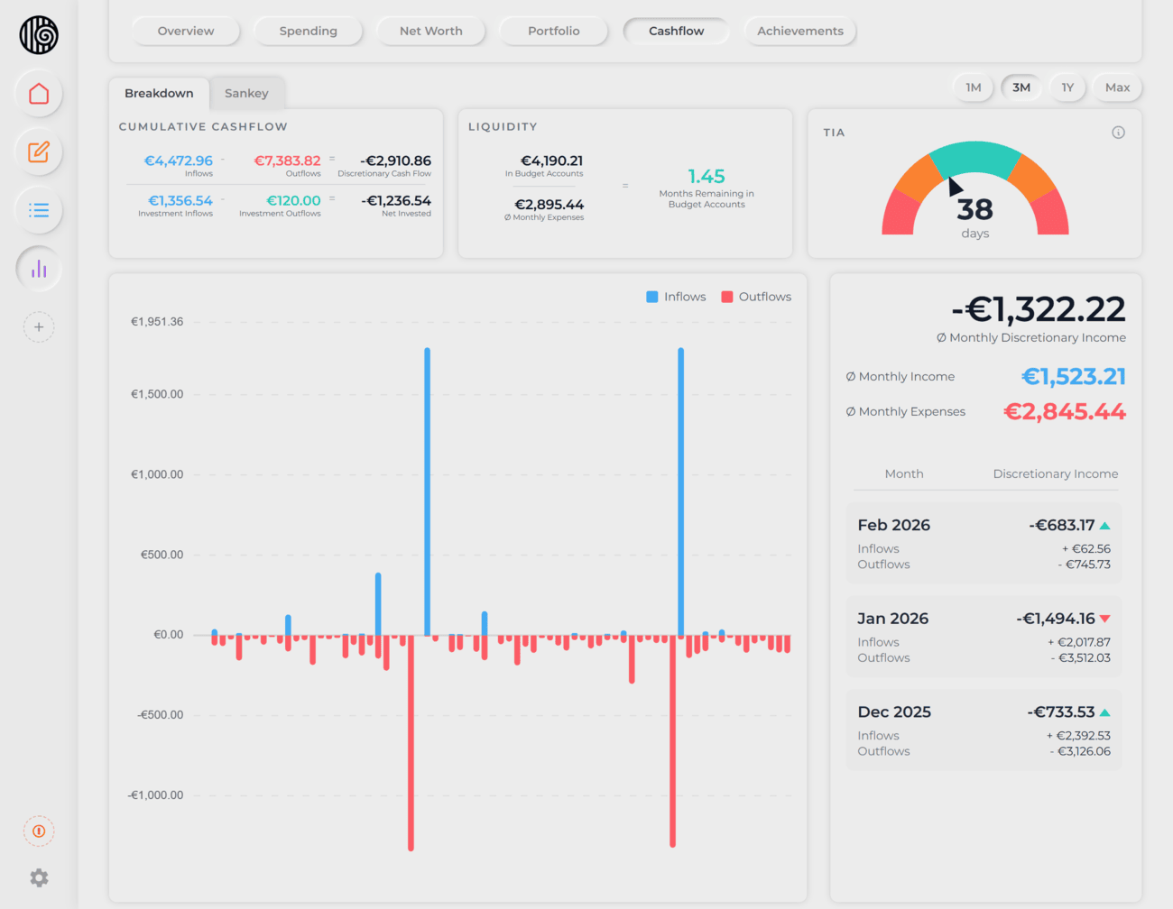
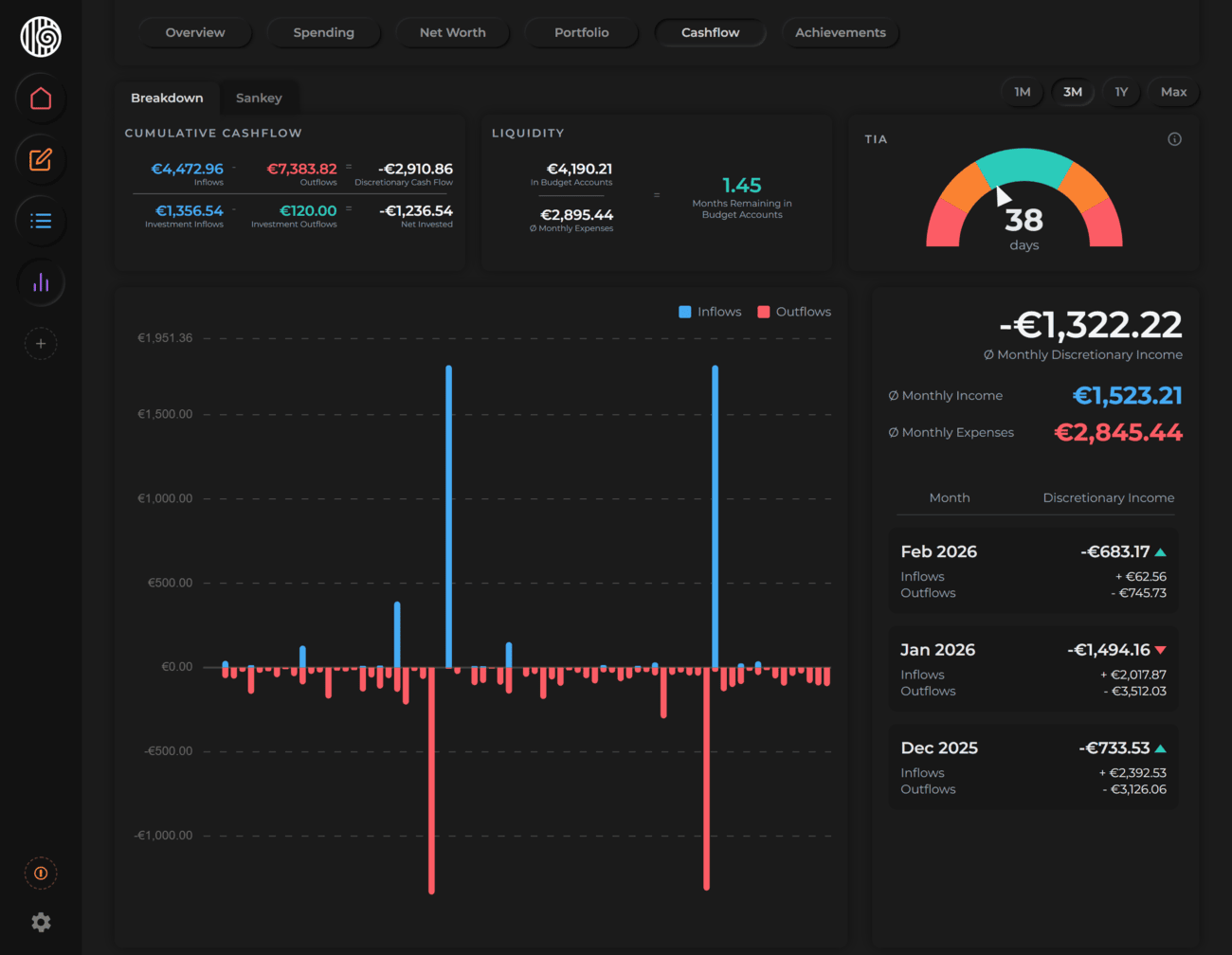
Sidebar
The sidebar to the right of the chart shows averages and a full monthly history.
Averages at the top of the sidebar are calculated across the selected time range. The method varies by range:
- 1 Month — daily averages across all days from your first transaction through today. The sidebar shows your total net income for the month rather than a monthly average.
- Latest 3 Months, 1 Year, Max — monthly averages. The current (in-progress) month is projected using a run-rate:
spent so far × (days in month ÷ days elapsed). That projected value is included alongside completed months to compute the average.
The three values shown:
- Avg Monthly Income — average inflows per month
- Avg Monthly Expenses — average outflows per month (excludes investment outflows)
- Avg Discretionary Income — Avg Income minus Avg Expenses
Because the current month is always projected and early months may have limited transactions, averages can shift noticeably when you first start tracking. They stabilize as more months of data accumulate.
Monthly history below the averages lists each month with:
- Total inflows
- Total outflows
- Discretionary income — with a green arrow if better than the previous month, or a red arrow if worse
Sankey
The Sankey tab visualizes the full journey of your money — from where it came in, through every category and subcategory, all the way down to individual tags.
The diagram flows left to right:
Inflow sources → Categories → Subcategories → Tags
Each band's width is proportional to the amount it represents, so you can immediately see which income sources are largest and which spending categories consume the most.
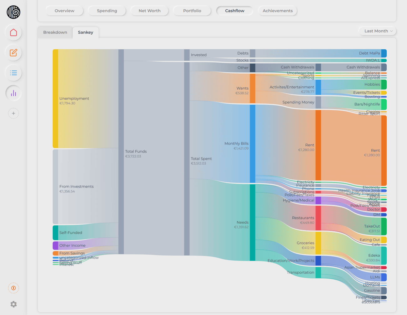
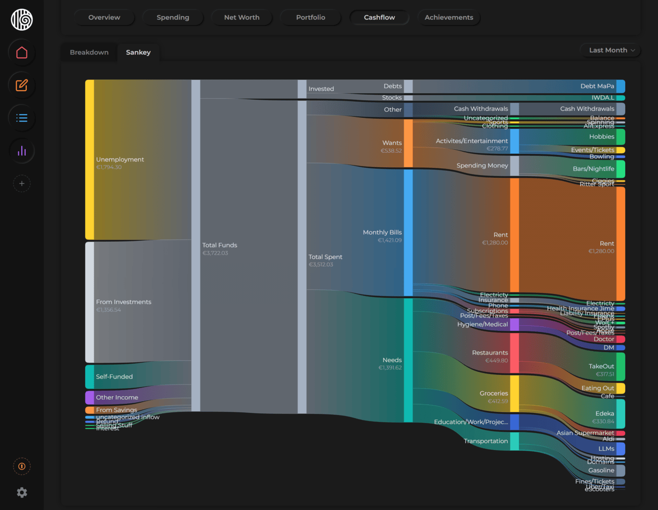
On smaller screens, the Sankey is simplified — tags may be hidden depending on available space.
Time ranges
| Option | Period covered |
|---|---|
| This Month | Current calendar month |
| Last Month | Previous calendar month |
| Latest 3 Months | The current month and the two prior months |
| This Year | January through today |
| Last Year | The previous full year |
| All Dates | Everything since you started tracking |
Most people know roughly how much they earn and spend. The Sankey makes the path visible — you can see at a glance whether your discretionary income is flowing toward intentional goals, or quietly disappearing into small, repeated expenses.