Spending
The Spending report gives you a detailed view of where your money actually went — broken down by category, subcategory, and tag, across any time range you choose. Three visual sections work together to tell the full story of your spending patterns.
All spending charts reflect outflows from on-budget accounts only. Transactions in off-budget or investment accounts are not included.
Spending Trends
The default view when you open the Spending report. A stacked bar chart shows your spending across the selected time range, with each bar broken down by master category — so you can see not just how much you spent each month, but what kind of spending drove it.
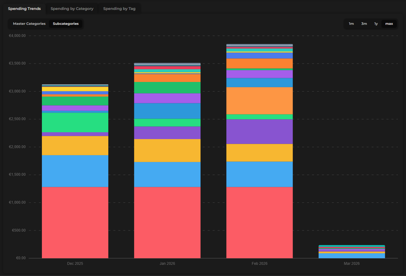
Toggle Subcategories/Master categories
Toggle the chart to subcategories for a more granular view. Instead of broad groups, you'll see individual envelopes — useful for pinpointing exactly which spending habits are growing or shrinking.
Time ranges
Use the time range selector to control how many months the chart covers:
| Option | What it shows |
|---|---|
| 1 Month | The current month only |
| 3 Months | The past three months |
| Last 3 Months | The three months prior to the current one |
| 1 Year | The past 12 months |
| Max | All months since you started tracking |
Sidebar
The sidebar beside the chart adapts based on how you've configured it:
- By month (default) — lists each month in the selected range with its total spending, plus your average monthly spending across all months shown
- By category — switches to a ranked list of every category and how much was spent on it within the selected time range
The By category sidebar is great for an end-of-year audit — switch to 1Y and see your biggest spending categories across all your tracked history.
Spending by Category
A donut chart that breaks down your spending by category for the selected period. Each segment represents one category, sized by its share of your total spending.
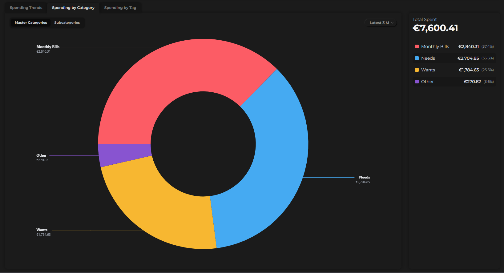
- Hover over any segment to see the category name and its percentage of total spending
- The sidebar shows a full ranked list of categories with their amounts
- Toggle between master categories and subcategories to adjust the level of detail
Time range
Use the dropdown to select the period:
- This Month
- Last Month
- Latest 3 Months
- This Year
- Last Year
- All Dates
The time range for Spending by Category is independent from the Spending Trends time range — you can view them at different scopes simultaneously.
Spending by Tag
A second donut chart, identical in layout to Spending by Category, but organized by tag instead of category.
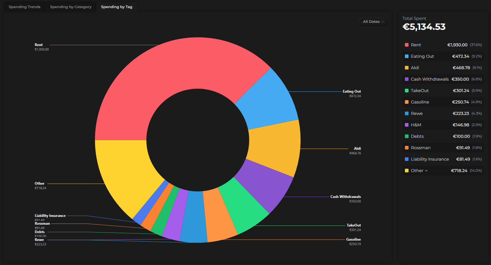
Tags let you group transactions across different envelopes — for example, tagging expenses from a vacation, a home project, or any spending theme that cuts across categories. The Spending by Tag donut shows you the total cost of those themes at a glance.
The same time range options apply: This Month, Last Month, Latest 3 Months, This Year, Last Year, and All Dates.
If you don't use tags yet, this chart is a great reason to start. A tag like "Holiday 2025" applied across flights, hotels, and dining will instantly show you what that trip actually cost.