Net Worth
The Net Worth report shows your total financial position — assets minus debts — across three views: a historical Performance chart, a Real-Time graph, and a Composition breakdown.
Performance
The Performance tab is your default view when you open Net Worth. It gives you a month-by-month picture of how your assets, debts, and net worth have evolved over time.
Summary stats
At the top of the tab, three numbers give you an at-a-glance read of where you stand right now:
- Debts — total liabilities across all your accounts
- Assets — total value of everything you own
- Net Worth — assets minus debts
The chart
Below the stats, a combined bar-and-line chart visualizes your history. For each month:
- The left bar (red) represents your total debts
- The right bar (blue) represents your total assets
- A dot on the line marks your net worth for that month, connected across months to show the trend
Use the toggle above the chart to change the time range: 3 months, 1 year, or Max (all recorded history).
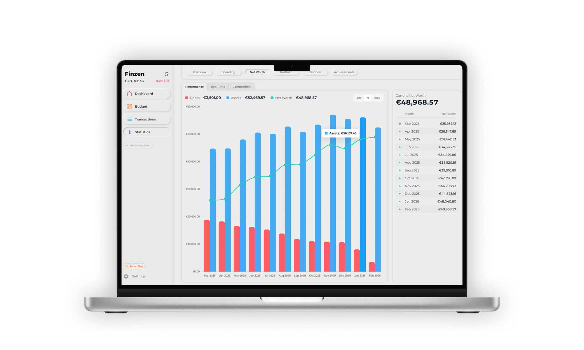
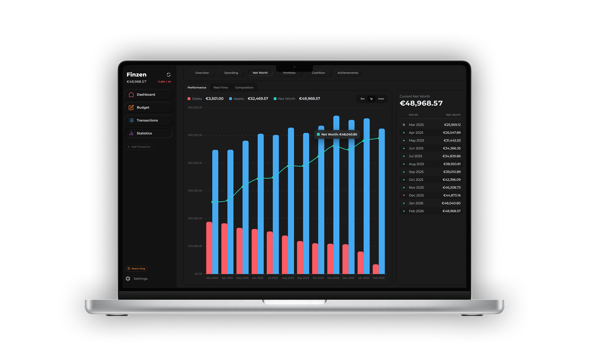
Monthly history sidebar
To the right of the chart, a running list shows your net worth at the end of every recorded month. Each row displays the month and its net worth value, along with a directional indicator:
- Green arrow — net worth increased compared to the previous month
- Red arrow — net worth dropped compared to the previous month
- Gray circle — the current (in-progress) month, shown without a trend indicator since the period hasn't ended
Net worth snapshots are saved at the end of each month. Because prices can shift in the minutes around midnight, there may be slight variations in the recorded value. Finzen aims to capture the most accurate figure possible.
Real-Time
The Real-Time tab plots your net worth as a live graph, updating continuously as market prices change.
Time frames
Choose from eight time ranges to zoom in or out:
| Time frame | Data resolution |
|---|---|
| 1 hour | 1-minute steps |
| 24 hours | 10-minute steps |
| 1 week | 1-hour steps |
| 1 month | 4-hour steps |
| 3 months | 1-day steps |
| 6 months | 1-day steps |
| 1 year | 1-day steps |
| All time | 1-day steps |
Hovering on the chart
Move your cursor across the graph to inspect any point. The tooltip shows:
- Timestamp / date of that data point
- Net worth value at that moment
- Change since the start of the current view (so you can see how much you've gained or lost within the selected time frame at a glance)
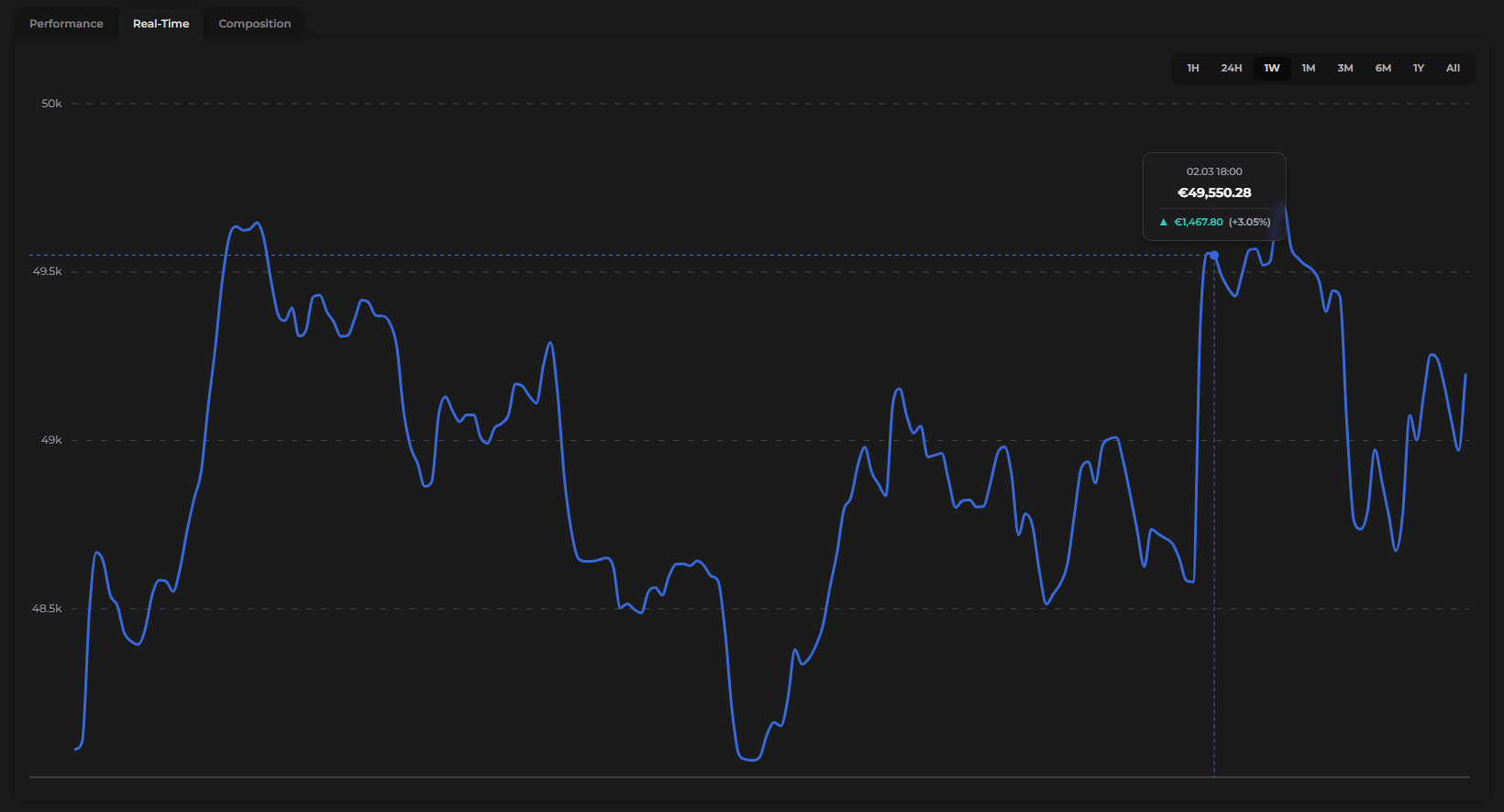
Switch to the 1-hour view when markets are active to watch your portfolio value move in near real time.
Composition
The Composition tab breaks down what your net worth is made of, using a donut chart similar to the one in the Spending report.
Chart views
Use the toggle to switch between two views:
- Account types — groups your holdings by category: on-budget accounts, off-budget accounts, and investment accounts
- Assets — shows every individual holding (e.g. Tesla, Bitcoin, Gold) as its own slice of the donut, labeled by its ticker or symbol
Sidebar
Alongside the donut, a ranked list shows each item's name and the percentage it represents of your total net worth — from largest to smallest. This makes it easy to spot concentration at a glance.
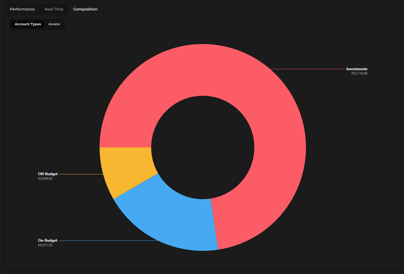
Net worth isn't just your bank balance — it's the complete story of your financial life. The Composition tab makes that story visible, so you always know what you own, what you owe, and where your value actually lives.